Saturday, September 28, 2013

Compare and Contrast

    I painted a watercolor study last night from this photo I took.  I am learning a lot
in my landscape painting class, especially about the importance of contrast
and how to achieve it.  This is something I have had trouble with in the past.
Contrast is so important as it helps direct the viewer's eye.  It can draw you
into a painting, and help show depth.  It's tricky to get very dark with watercolor.
Use three colors to get the darkest color, and layer color as it dries and lightens.

     The drawing is a bit off and this painting feels a little lonely.  I really
like the effects I got with the wash.  I see hope on the horizon.
    Again, I highly recommend taking any art classes.  My class is taught at
the local art guild, and is very economical.  The teacher is an award winning
watercolor artist.   Look into classes in your area,  or just get outside and
paint or draw.  Go out when there is dramatic lighting, I found the morning
and evening hours to be the best.  Have fun!

Saturday, September 21, 2013

Can I Play? Yes!

    I did this little artwork yesterday.  I started on it a few days ago.  The description
of my process may help other illustrators, so here goes. My first step was
transferring my sketch of the children onto the paper (Legion Stonehenge Pearl Gray).
Then I used a Pigma Micron waterproof pen to create the lines. While letting the
line art sit for a day I got this vision.  I wanted to do a series of fun pieces (for a show
coming up in November), kid inspired, with happy colors and glitter.
    A day later I filled in the color with watercolor/pencils.  Then I felt worried.  What
next?  It wasn't looking so happy.  The gray of the paper is subtle, but was a tad drab.
I kept feeling like I wanted to stamp (NO, not stomp) on it, but nothing I had was right.
Searching around my desk I found a clean white eraser, perfect for a hand made stamp.
I wanted a diamond shape, so did that first with a sharp blade, gradually thinking of and
adding stamp shapes as I went along.  I got a great set of neon-ish ink pads at Michael's
and I used those.  It felt risky to be stamping on my work, but thrilling and fun at the
same time!
    The work needed something else.  I searched for my pastel pencil with no luck but
found a box of pastels with wonderful white.            
                                                                                    Holding my breath, I started to write on
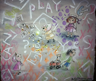
my work, making hopscotch boxes and numbers and words.  Suddenly I loved it.
It needed more, the final touch...yes, glitter.
This piece felt like a small
stepping stone. It inspires me and makes me
happy.
Here is the final work, you may have seen earlier on twitter.
I feel like in the age of all perfect digital art,
I have been wanting to work more
traditionally.  Maybe it is avoiding reality,
but I like to look at it like it's just me being
my rebellious artistic self.
I know how to do digital, it's just not very
appealing to me right now.  It seems like
so many artists are going that way, and I
feel a little sad about it.  Sometimes it is the imperfections in art that add interest.  I am learning
so much about value and color theory from my watercolor landscape class.  This is guiding me
as I do illustration.  I hope my posts are helping other illustrators out there who are finding
their way.  Please post a comment if this is doing you any good.  I will continue to give tid bits
of art tips as I go along.  Peace and love. + Now get out and draw!

Friday, September 13, 2013

Bold Cats

    Today I went to my first watercolor landscape painting class.  I have done
watercolors for years, but this was a big eye opener.  It made me realize how
much I still have to learn about value and color.  I think taking this class will
really help with my illustration work for children's books.  My struggle with
watercolors has always been that there is never enough contrast.  There's the
fear of going too dark, such permanence in it.  The teacher threw down color
with boldness that made me nervous.  When he was finished it was like a
miracle.  Perhaps that is what it takes.  Be bold.  Step outside your boundaries.
   What have I got to lose?  Quality paper that's all.  The thought still makes
me feel a little ill.  What am I so afraid of?
    Yesterday a close friend said to me that pursuing a career in children's books
was a huge risk.  Sure it is.  So is walking down the street or driving a car.
    I have been wanting to do this basically my whole life,  since 2nd grade
when I won the Caldecott Award for a class book project.   Somehow I got
sidetracked.  My parents told me the art world was so competitive, there
would be so many more jobs in fashion.  (They didn't realize that most of those
jobs are in New York City and I would have to move away.)  They are
right about art being competitive of course.  I didn't even realize how much
until going to SCBWI conferences and joining Twitter.
    My determination helped me learn to paint textile prints with gauche.
When designing on the computer became the way to go I taught myself
that, plus how to do repeat patterns.  The first instinct was a feeling that it
was impossible.  A big slice of cheese for you all...believe in YOU.
Nothing is impossible with hard work.  It is WORK, but I know one
day it will pay off.
I was going through my scrapbook from
grade and high school and I found these
sketches.  The depictions of the secretary,
principle, teachers, and a couple of my
friends still make me smile.   I think I was
inspired by Garfield, always loved that
cat!
Illustration is in my heart.
I just can't
tell it no.


Friday, September 6, 2013

Getting Bord? Aquabord!

  This week I was excited to get into a craft show that will be going on in November.
I am going to focus on doing some little paintings for children's rooms.  I will have to
divide my time between creating work for the show and a book I am working on, but
I think it will be good to have a little nest egg of finished work.  
    Here are some sketches of a few ideas.  Wanted to have a sweet look little girls
and boys might like.  A friend gave me the idea to personalize them (thanks Teresa!)
  I thought it would be best  to
keep it simple , since I am using
small Aquabord I just bought.
(It does come in bigger sizes,
just more expensive.)  I have
never used this but am
excited to try it.  It is supposed
to absorb watercolor like a
"fine paper".
   Recently I also purchased
Stonehenge drawing paper
which was recommended to
me by an art teacher.  It is so
heavy and feels great.  I am
almost  afraid to use it!

I bought these from Blick
art supplies.  The Aquabord
is affordable but the paper a bit pricey but I was getting let down by cheap paper
after doing so much work.  I will save this paper for final art.
  My art teacher also recommended drawing gum.  I bought Pebeo brand, though I
am not  sure of the quality.   It has been ages since I have tried it and I recognized
this brand.  Anxious to try out all of these but a bit intimidated.  It always feels that
way a little when breaking in new supplies.  Best to just go for it.  See you next
week, until then, happy, happy, joy, joy.